My journey at State Farm started in 2014. The organization had just stood up a new UX practice in Atlanta, GA, and I was hired on as a UX Lead. While I've worked at other large organizations in the past, State Farm is a different kind of beast. Founded in 1922, the company boasts over 91 million insurance policies and accounts while serving over 19,000 agents across the country. One of State Farm's greatest assets is its size, securing over 15% market share, making it the largest auto insurer in the United States. However, its size is also an achilles heel, limiting how fast it can move in an ever changing world. Standing up the UX practice would enable the company to exercise a more narrow focus on the customer experience, helping to maintain their edge over competitors. My role was to help facilitate that goal.
My Journey as a UX Lead
As a UX lead I carried many responsibilities. Some of them included:
Provided creative direction for digital user experiences and promoted / facilitated creative collaboration across project teams.
Served as the primary liaison among design teams.
Served as an advocate and voice for championing User Centered Design across business channels.
Promoted and educated non-UX practitioners on the disciplines of UX within State Farm.
Collaborated closely with user researchers, business, project teams, business analysts, designers, copywriters, and developers to optimize digital user experience.
Promoted a mobile first philosophy.
Utilized research insights to build an in-depth understanding of target users needs, tasks, and goals as they apply to design.
A better way to design
I quickly noticed that the practice was utilizing tools and processes that created inefficiencies within teams. Since the practice was only a year old when I joined, it's understandable as to why better tools had not been suggested and implemented. It was still early days. UX Designers were using tools like Axure to build complicated and bloated prototypes. Wireframes were often built using Axure in an attempt to save time. High fidelity designs were mocked up in Adobe Illustrator and Photoshop. Simple prototypes would take weeks to churn out and many more weeks to run through revisions. The majority of the floor was also using PCs instead of Macs.
To solve this problem I partnered with our internal process improvement team and helped lead an effort to update our toolset. If you know anything about large enterprises, this was no easy task. But after a year and a half, I was able to spearhead the transition towards using InVision for rapid prototyping and Sketch for designing. I also helped lead an effort in convincing corporate to shift our work machines over to Macs instead of using PCs for design work. Besides, Sketch didn't run on PCs.
These changes greatly improved the efficiency for our practice but also delighted the practitioners. The design process was no longer a chore.

Steer Clear
During my stint as a UX Lead I had an opportunity to work on several efforts and lead multiple design teams. The opportunities ranged from improving State Farm's authenticated experiences to leading a team to redesign the website of what was once State Farm Bank.
While I had the chance to lead many great designers across multiple efforts, there are a few that I'd put into the most memorable column. One of those efforts is the redesigning of the Steer Clear® mobile app back in 2017.
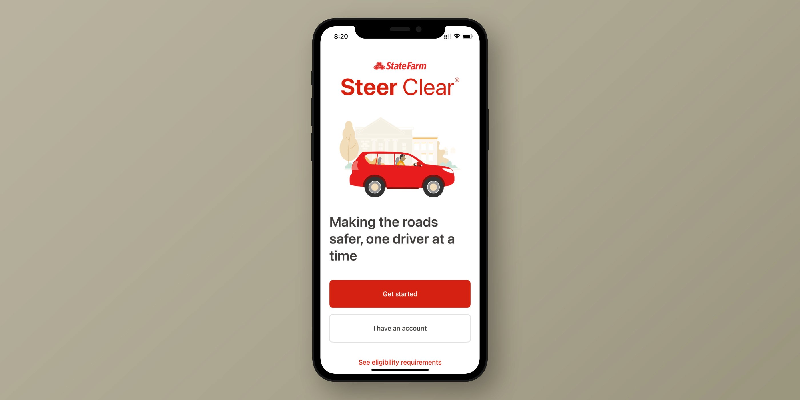
Steer Clear® is a discount program available to help teen and young adult drivers improve their driving skills. Despite the existence of a mobile app, customers were required to engage in course material on their computer and fill out PDF forms to track their progress, which they would then send back to their agent. Drivers used the mobile app specifically to have their driving hours record as part of the course completion requirements.
Working with our business partner, we leveraged field notes received from several agent offices as well as feedback our enterprise research group had gathered through in-person interviews. This information helped us shore up goals for the effort. Here are a few:
Make it easier for young adults to onboard into the program.
Provide a course complete with training videos and quizzes for education purposes.
Provide a way for drivers to put what they've learned into practice.
Provide a way for the program's driver to receive feedback on their driving.
Provide a way for young drivers to add mentors such as a parent to view their progress.
Provide a way for the business to understand the customer experience to improve the program.
Increase overall customer satisfaction and boost App Store ratings from 3.5 stars.

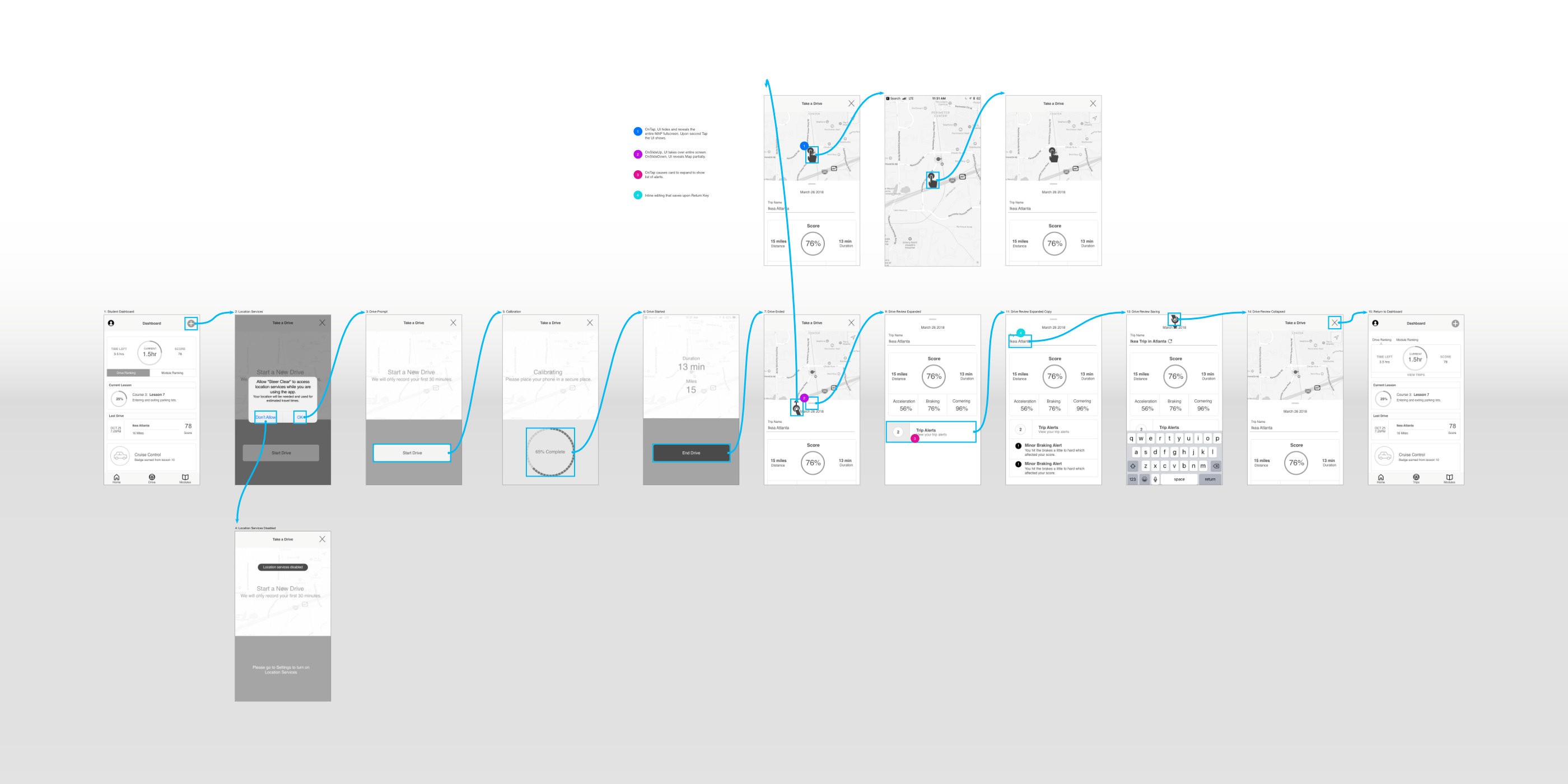
When I first received the assignment I only had 1 UI Designer and Content Strategist to work with. To make matters more complicated, since the practice was so young, this effort was the first mobile application effort it had received and we had no practitioners who were experienced in designing mobile applications. So I leveraged my experience in designing and developing mobile applications and architected the entire app. Sometimes as a Lead you have to get your hands dirty. My small design team consisting of one UI Designer and a Content Strategist, working in tandem with the mobile app development team and our business partners weren't going to be stopped.
Our small but mighty team engaged with our internal creative services team for the development of the training videos. We worked with our internal Brand & Marketing team to ensure we were all in alignment with the marketing materials that were being developed.
We pitched and implemented a gamification system within the app to encourage drivers to move forward in the course material. With the completion of each module drivers would earn points and badges. The achilles heel for the mobile app was its algorithm which was outdated. Working with our development team we partnered on how it could be updated to deliver the best experience and more accurately record driver's trips.
The effort lasted a little over a year and about 6 months in I was assigned a UX Designer which alleviated me from having to "get my hands dirty". Shifting exclusively back into my Lead role enabled me to focus more on removing any roadblocks the team often faced, while still being able to act as a mobile consultant.
So how did the app fair when we were done? Aside from solving the problems we set out to solve, it became a 5 star application.
Shifting to Product Management
As a PM I carry many responsibilities with some that overlap the traditional product owner role. Here are a few of them:
Development of product vision and strategy based on the identification of business and customer problems.
Conduct quantitative and qualitative research to better understand customer pain points.
Lead product discovery to determine business and technical feasibility.
Work collaboratively across the organization to include business, marketing & brand, data & analytics, enterprise research, UX, engineering, platform, AI Strategy, product adoption, operations, legal, compliance, risk and others.
Conduct market research.
Champion of the customer and customer centric experience.
Facilitates product piloting.
OKR/KPI development.
Roadmap development and management.
Product backlog development.
Facilitation of sprint planning and grooming.
Since moving to Product I've had the opportunity to lead a few different teams with one of them being State Farm's website product team. For this assignment, I was responsible for developing a new strategy and vision for experiences related to the consideration stage of the user journey. My chief focus was on auto shoppers. The overall objective was to drive more people into the auto quote experience.
Developing the strategy took collaboration with several partners within the organization; marketing / brand, personal lines auto, enterprise research, UX, SEO, data & analytics, legal, compliance and others to include the engineering team who had to execute the work.
What I realized upon studying the website and the data that I was able to gather, was that the State Farm website needed to leverage its value propositions and history. I also wanted to ensure that the website's messaging was an extension of the communications that marketing and brand advertise. At the time it wasn't. It was common for marketing and promotional materials to mention certain discounts available, however the website would not. I saw these types of gaps as low hanging fruit and easy opportunities we could quickly capitalize on. I felt these were must-haves if we were to be competitive. Our value propositions needed to be front and center while shoppers were researching and evaluating us against other insurers.
Today, when you visit State Farm's website, the messaging around bundling and saving, as well as the explicit callouts to multiple discount programs was a result of this effort. The strategy and subsequent execution provided the necessary lift that the organization was desiring by increasing overall engagement and auto quotes for those in the auto shopping journey.
AI and Product Management
As I mentioned earlier I've been able to work across multiple product teams. Currently I'm responsible for the development of a new product that will be used by our agency force of 19,000 strong. This new product leverages AI technologies and is focused on helping agents better service millions of State Farm customers. That's all for now!
